The design of an album cover often describes musicians and their style. Some artists are even identified by their album covers because they become iconic. What is a better example of fusing words with images than album cover design? Here are several examples of creative album covers that play with the combination of the words and images:
 |
| Image from: http://grungehouse.com/cd_cover/album-cover-047.htm |
 |
| Image from: http://content9.clipmarks.com/blog_cache/www.thetoyzone.com/img/37763893-9DD3-4A7A-A914-9113163ACCD6 |
 |
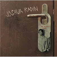
| Image from: http://image.kazaa.com/images/19/888880162519/Joshua_Radin/We_Were_Here/Joshua_Radin-We_Were_Here_3.jpg |
 |
| Image from: http://backseatcuddler.com/wp-content/uploads/2008/12/topalbums1.jpg |
Led Zeppelin’s ‘Physical Graffiti’ album cover intrigues me. It was confusing, trying to make sense of the individual letters in the windows of the building. Then, once I figured out that was the title of the album spaced out in that way, I appreciated the time it made me spend analyzing the composition of word and image.
The font from The Beatles’ ‘Yellow Submarine’ album cover matches the abstract depiction of a submarine. The selection of font and layout creates aesthetically appealing gestalt for the cover.
The combination of word and image in Bruce Springsteen’s ‘Born in the U.S.A.’ album cover is simple yet significant. The color chosen for the words connect them with the image of the American flag. It is an engaging use of word and image.
Joshua Radin’s ‘We Were Here’ album cover is a playful fusion of word and image. His name is scratched into the image of the door, and the album’s title is print on the image of a doorknob hanger; combining the two elements into a single idea.
The font from Lady Gaga’s album, ‘Just Dance,’ ties into its theme (of clubs, partying, etc.) It was a significant choice because without it, her photo does not describe the whole mood of the album.

No comments:
Post a Comment